Friday, July 30, 2010
Social Network
This is generally considered a flow map as there is no reference to space or distance. This depicts the social network of "George".

Stem and leaf Plot
A stem and leaf plot show statistical data in a graph format to help visualize distribution. The chart above the cost of a diagnostic mamogram procedure. The numbers on the left represent the charge and the numbers on the right represent the number of times that amount was charged for the procedure.

Orthophoto map

This orthophoto map shows land features using color-enhanced photographic images. This photograph of the State Capitol in Jefferson City, Missouri was taken at an oblique angle and maps of the entrances to the capitol.
Classed Choropleth Map
This is a classed cloropleth map that is using color coded equal data intervals. This one depicts the number of males per 100 females in the United States.

Triangular plot

The triangular plot displays three sets of data. This one depicts the chemical analysis of igneous rocks
Thematic census map (cloropleth)
 http://www.elderweb.com/book/export/htm
The thematic reflects a particular theme over a specific geographic area. The theme here is census.
DLG map
The DLG map recreates the features of a US Geological Survey topographic map into a digital format. This is digital line graph of Beaufort South Carolina as produced by the U.S.G.S.


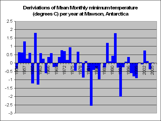
Bilateral graph
 http://gustofhotair.blogspot.com/2006_11_01_archive.html
The chart above represents a bilateral graph. This one depicts the deviation (plus or minus and degree) from the monthly mean temperature in Mawson Antarctica
Unclassed choropleth map
The unclassed choropleth map assigns shadings proportional to the data values without classifying the data. The map above shows the fertility rates in Europe in 2002. The darker shaded areas showing the highest fertility.


Scatter plot
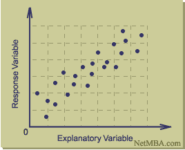 http://www.netmba.com/statistics/plot/scatter/
Scatterplot showing relationship between two varibles.

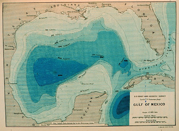
Lidar gps bathmetry
NASA project using GPS, LIDAR and Bathmetry in the Gulf of Mexico. The GPS provided an accurate target and the LIDAR provided the subject. Bathmetry of island was the goal.


DOQQ MAP
Digital orthophoto quarter-quadrangle images provides critical geospatial data. This one is a high altitude photograph of Texas football stadium.

DEM map
A digital elevation model is a digital representation of the actual terrain. The DEM above includes both actual photograph and lines added.

Geopotental heights (contour map)
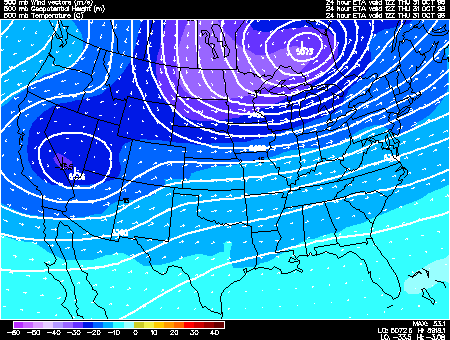 http://ww2010.atmos.uiuc.edu/(Gh)/guides/mtr/cyc/upa/hght.rxml
Goepotenial height of given equal air pressure,usually shown in meters above sea level
Bathymetric (contour map )
Thursday, July 29, 2010
DRG image
 https://www.e-education.psu.edu/natureofgeoinfo/book/export/html/1809
A digital raster graphic (DRG) is a scanned image of a U.S. Geological Survey (USGS) standard series topographic map. The map above is a DRG image of Bushkill Pennsylvania.
Isopleths map
 http://mermaps.blogspot.com/2008/11/contour-maps-isobars-isotachs-isohyets.html
An isopleth map generalizes and simplifies data with a continuous distribution. This map depicts isobars (isopleths) of air pressure.
Isohyets map
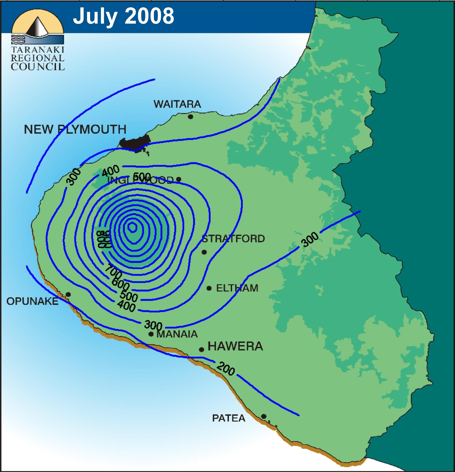 http://www.scoop.co.nz/stories/AK0808/S00090.htm
An isohyet is a line that shows average amount of rainfall. This is a rainfall map of Taranaki, New Zealand.
Isotachs
 http://hoekstrasmaps.blogspot.com/2009_04_01_archive.html
An isotach is a line showing the contrast in wind speed. The map above shows a severe wind pattern over the Great Plains area. The wind is moving towards the east and is typical of a cold front pattern.

Infrared aerial photo
 http://www.aerialarchives.com/infrared.htm
This is an infrared aerial photo of the Sacramento deep water channel showing the propensity to flooding.
Cartographic map
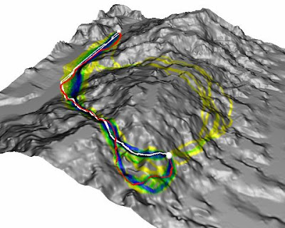
http://worldofmaps101.blogspot.com/2008_07_01_archive.html
A cartograpic animation map adds a temporal component. This one shows a path around a mountain.
Statistical map
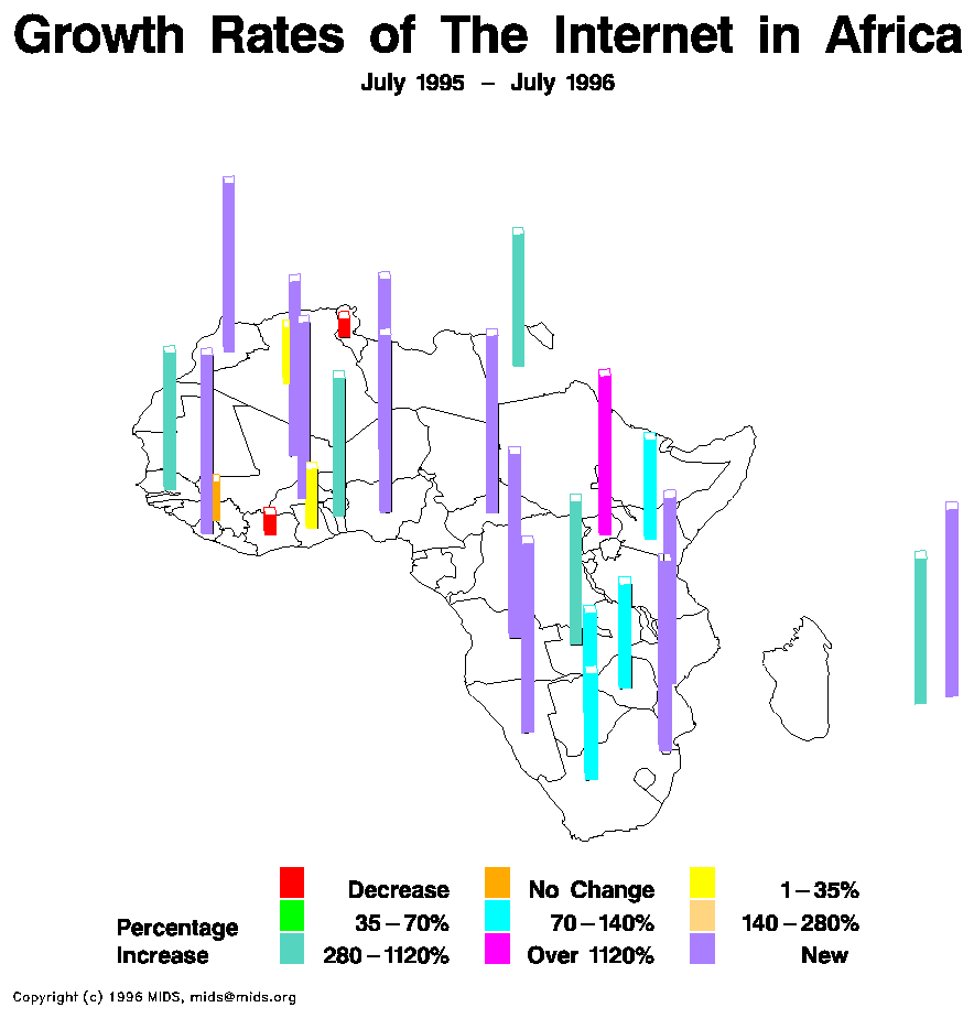 http://personalpages.manchester.ac.uk/staff/m.dodge/cybergeography/atlas/census.html
This is a statistical map showing the growth of internet usuage in Africa.
Isoline map

This the map indicating a simple isoline or contour line indicating forecast wind speeds.
Propaganda maps
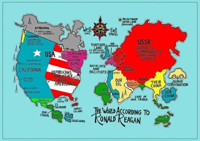 http://rjm09mapcatalog.blogspot.com/2009/11/propaganda-maps.html
Propaganda maps are often used by government to manipulate and shape the views of their population to feel a certain way about a topic at hand. This map was used during Ronald Regan's presidency to shape views about the cold war.
Hypsometric map

http://www.reliefshading.com/colors/hypsometric.html
This is a hypsometric map of France showing elevations by shading.


Palimetric Map

http://www.nps.gov/history/history/online_books/fova/clr/clrt.htm
This is a Planimetric map of Vancover which represents only the horizontal positions of features without elevations.

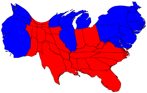
Cartogram
A cartogram is a map that is distorted to convey information. This map is a cartogram representing Republican (red) and Democratic (blue) states distorted to represent voter population.
Doppler Radar
This doppler radar depicts a weather pattern moving over the Great Lakes region. The doppler effect is the change in a frequency of a wave moving relative to the source of the wave.

Lidar site
 http://vulcan.wr.usgs.gov/Volcanoes/MSH/Eruption04/Monitoring/eruption_monitoring_oct-nov_2004.html
LIDAR (line detection and ranging) is an optical remote sensing technology. This is a must see interactive lidar site of active Mount St Helen. The plane that took this was at risk!

Windrose
This windrose depicts the wind speed and wind direction at an airport in Australia measured at 9 and 3.

Climograph
 http://www2.volstate.edu/kbell/climographs.htm
This climograph depicts average temperature and rainfall over a one year in Manaus, Brazil.
Choropleth map
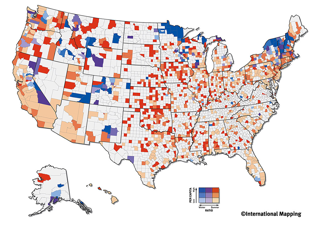 http://mapanalysisnoles949.blogspot.com/2008/06/bivariate-choropleth-map.html
A choropleth map depicts information by shaded areas. This one depicts where winter and summer olympic competitors live based on per capita income of the counties by state.
Isopach map
 http://mapanalysisnoles949.blogspot.com/2008/06/isopachs.html
Isopach showing equal vava flows.This s at least a 30 mile total flow.
Cadastral map
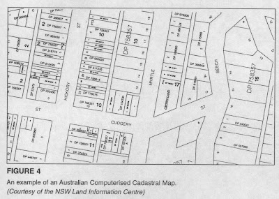 http://mikesmaps.blogspot.com/
Basic cadastral map from Australian GIS system. It shows plot size of lots and location of lots on streets.
Wednesday, July 28, 2010
Point Map

This is a point map of doppler radar sites Western states have lots of locations. Tornado alley is covered well. Why a site in the middle of Danali?
Subscribe to:
Posts (Atom)